Hazel Soan’s blog on painting in Paradise
Painting in Paradise – Blog by Hazel Soan
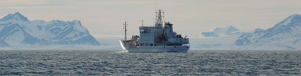
The Island of Sri Lanka is positioned just north of the equator, almost touching the Indian subcontinent to the north. South lies only ocean and, far away, Antarctica. This was a new destination organised by Spencer Scott Travel for The Artist Magazine as a painting holiday, it was also a new destination for me. We met a welcome atmosphere, abounding in the presence of natural bounty, abundant colour and gentle people. Here luxury is found in warmth, sunshine and visual inspiration.
Sri Lanka is lush and green from the air. If you know my work you can guess that green is not my most favoured colour! I tend to echo Boucher’s sentiments about verdant landscape: “ too green and badly lit” and seek instead the yellows, reds, blues and violets found in nature. But the greens of Sri Lanka are well lit, and lovely, so varied, so yellow and so blue. I was entranced. Neither did they predominate because the other colours of Sri Lanka are also vivid: the women in colourful saris, the monks in vibrant orange, another orange for the coconuts, multi-coloured fruit stands and fishing boats, and the blacks, reds, and blues of every form of transportation imaginable, jostling for priority on chaotic roads. And, added to all that, the yellows, mauves and pinks of equatorial sunsets, riding high on rising cumulonimbus clouds and spread across hazy horizons. It was paradise indeed for painters!
1. Painting: “Homage to Winslow Homer, and to green” 30 x 22 inches 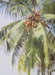
Caption: The American painter, Winslow Homer, painted a great close-up of a King Palm which had always intrigued me. I found a similar subject beside the hotel grounds. I used masking fluid to preserve the highlights, and Aureolin and Cobalt Blue and Burnt Umber, lifting colours, to make the greens, so I could soften harsh lines easily.
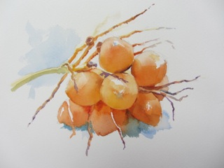
Our group filled the small colonial hotel in Galle on the southwestern tip of the Island, creating the atmosphere of a house party. Being able to leave painting things around on seats, tables and walls made for relaxed and pleasantly productive days painting within the courtyard grounds. The hotel staff were happy to help in providing wonderful subjects. They brought down clusters of coconuts for us to paint and found a graceful lady to pose in a colourful sari.
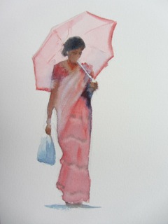
2.Painting: “The lilac sari” 20 x 14 inches Arches rough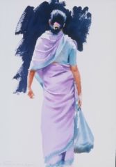
Caption: The sari must be the most elegant of female attire. Colourful saris were a constant visual inspiration everywhere we went. The lilac here is painted with dilute Winsor Violet. The blouse a mix of Cerulean and Pthalo Turquoise and the black of the lady’s hair and dark background made by mixing the Turquoise and Violet together.
The days “at home” were interspersed with days or half days visiting outside locations. With a private coach at our disposal we could choose when and where we went to paint. The beach, the fishing folk, a morning at a tea plantation, a Buddhist temple, the famous stilt fishermen, Galle lighthouse, the town within the fort, and even whale watching, all provided attractive and challenging painting opportunities.
3. Small watercolour paintings

Stilt Fishermen
Caption: It was very hot painting out in the sun. We had to be fairly quick and seek as much shade as we could. Watercolour is a medium designed for speed, here are a few of the watercolour sketches, some were painted in less than 30 minutes, others took nearly an hour.
-
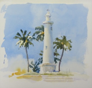
Galle Lighthouse
-
Lady in red
-
King Coconuts
-
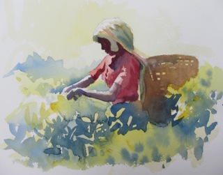
Tea Plantation
-
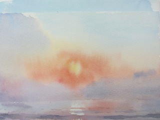
Hazy sunset
-
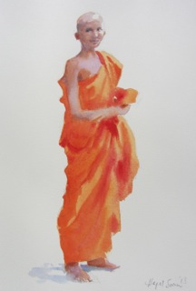
Orange monk
-
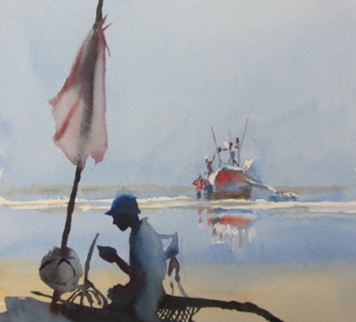
Fisherman on the phone
-
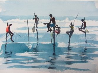
Stilt Fishermen
Since it was very hot and also very humid the drying times for watercolour were a complete unknown each and every time of day – it was essential to wear loose cotton and linen clothing to keep remotely cool but even then perspiration fell in dangerous drops onto unsuspecting watercolours! so I tapered my techniques to suit the widely varying evaporation rates. I had noticed that tropical paintings by other artists often had the softened look of lifted colour so I experimented with more of the lifting colours, eg Ultramarine and Cobalt Blue and the earth colours like Raw and Burnt Umber and Raw Sienna (which I hardly ever use). Using the lifting colours I found that I could move the pigment around for quite a long time on the damp paper to reposition the tones, creating a softened appearance to parts of the watercolour.
At dawn and sunset nothing dried, so having more than one sketch block to paint on proved essential !
I found Cobalt Blue very sympathetic for the colours of cast shadows here. The deep tones were much softer than in drier climes as the light was filtered through a haze of humidity and the clear blue morning skies were gentled by the presence of so much water in the atmosphere.
4. Painting “Overseers” (palm trees on shore) 10 x 11 inches, 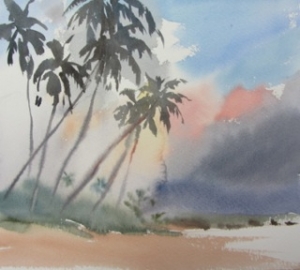
Caption: A quick 15 minute watercolour late in the day satisfies my desire to paint the shapes of the tall bendy palm trees and the spaces between their twisting trunks. The background sky would not dry so the trees are painted onto it with almost dry pigment, thus preventing the narrow lines spreading out too far. The dark green palm fronds are a mix of Burnt Umber and Cobalt Blue.
People, the shapes they make and the spaces between them have always been one of my favourite subjects. Every day we passed the fishermen selling their catch on the beach. Under the sagging tarpaulin canopies their shapes fell quickly into coloured sihouettes, it was a busy scene, a lot of movement and very hot (and rather fishy!) so I just concentrated on the shapes of the figures. I look for linked shapes bound together by a similar tone, not at the individual figures, boxes and shadows. So a man might be joined to a box, to a tree or to a portion of the canopy or to another figure.
Painting “Shades and shapes of fishermen” detail 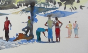
Caption: I painted the shapes with wet ultramarine and dropped strong opaque colours, Cadmium Red, Light Red, Cadmium Yellow, Cerulean Blue, into the blue wash to equate to the local hues of the amalgamated shapes. The blue underwash binds the colours in a universal mid to dark tone and so creates the sense of being in the shade. The figures lit by the sun on the right are painted with pure diluted colour.
The people of Galle play and bathe in the ocean throughout the day. One evening we saw a couple of families running along the shoreline, an evocative display of all the different ages and generations. The glee of the people mingled with the joy of the rich colours was a delight and a cheerful reminder that happiness is not linked to wealth but to love.
Painting: “Running for joy” 22 x 30 inches. 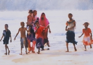
Caption: To create the joyful abandon of the running figures I let the rich reds, pinks and violets blend together and encouraged colour to bleed out into the white paper beyond. At first I overdid this and the painting looked rather fuzzy, so I restored sharp edges to the limbs by lifting off paint and adding Titanium white to restore the white paper. The movement is now held in the contrast between the soft blends and the crisp brushmarks.
Sri Lanka was an excellent place for a painting holiday. The humidity was outweighed by the visual inspiration all around us and the delightful service and welcome we received – we did hit a particularly hot spell of weather apparently but it was a great excuse to paint in sarongs!
I’d love you to join me on my next exotic painting holiday to the land of A Thousand & One Nights when she will be painting en plein air the Sahara to the Sea